- Joined
- Nov 1, 2002
- Messages
- 38,376
- Solutions
- 3
Follow along with the video below to see how to install our site as a web app on your home screen.
Note: This feature may not be available in some browsers.
Maps of the 2008 US presidential election results
[SIZE=+1]
(Maps for the 2004 election are available here) [/SIZE] Election results by state
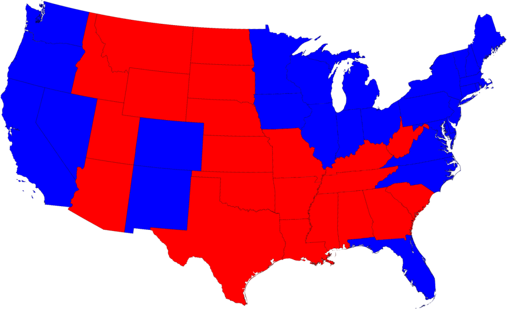
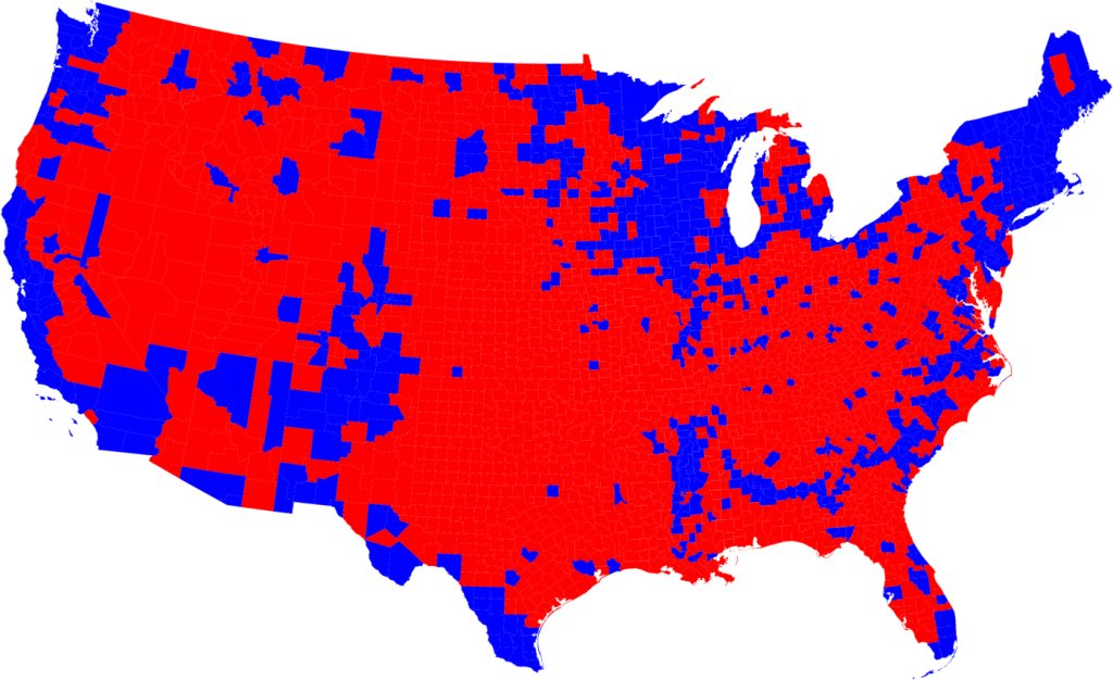
Most of us are, by now, familiar with the maps the TV channels and web sites use to show the results of the presidential election:
[SIZE=-1] Click on any of the maps for a larger picture. [/SIZE] The states are colored red or blue to indicate whether a majority of their voters voted for the Republican candidate, John McCain, or the Democratic candidate, Barack Obama, respectively. Looking at this map it gives the impression that the Republicans won the election handily, since there is rather more red on the map than there is blue. In fact, however, the reverse is true – the Democrats won by a substantial margin. The explanation for this apparent paradox, as pointed out by many people, is that the map fails to take account of the population distribution. It fails to allow for the fact that the population of the red states is on average significantly lower than that of the blue ones. The blue may be small in area, but they represent a large number of voters, which is what matters in an election.
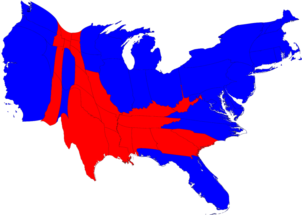
We can correct for this by making use of a cartogram, a map in which the sizes of states are rescaled according to their population. That is, states are drawn with size proportional not to their acreage but to the number of their inhabitants, states with more people appearing larger than states with fewer, regardless of their actual area on the ground. On such a map, for example, the state of Rhode Island, with its 1.1 million inhabitants, would appear about twice the size of Wyoming, which has half a million, even though Wyoming has 60 times the acreage of Rhode Island.
Here are the 2008 presidential election results on a population cartogram of this type:
As you can see, the states have been stretched and squashed, some of them substantially, to give them the appropriate sizes, though it's done in such a way as to preserve the general appearance of the map, so far as that's possible. On this map there is now clearly more blue than red.
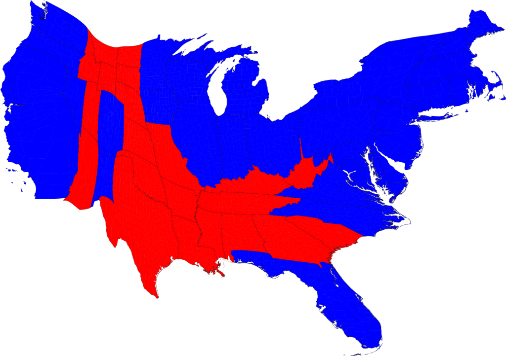
The presidential election, however, is not actually decided on the basis of the number of people who vote for each candidate but on the basis of the electoral college. Under the US electoral system, each state in the union contributes a certain number of electors to the electoral college, who vote according to the majority in their state. The candidate receiving a majority of the votes in the electoral college wins the election. The electors are apportioned roughly according to states' populations, as measured by the census, but with a small but deliberate bias in favor of smaller states.
We can represent the effects of the electoral college by scaling the sizes of states to be proportional to their number of electoral votes, which gives a map that looks like this:
This cartogram looks similar to the one above it, but it's not identical. Wyoming, for instance, has approximately doubled in size, precisely because of the bias in favor of small states.
The areas of red and blue on the cartogram are now proportional to the actual numbers of electoral votes won by each candidate. Thus this map shows at a glance both which states went to which candidate and which candidate won more electoral college votes – something that you cannot tell easily from the normal election-night red and blue map.
Election results by county
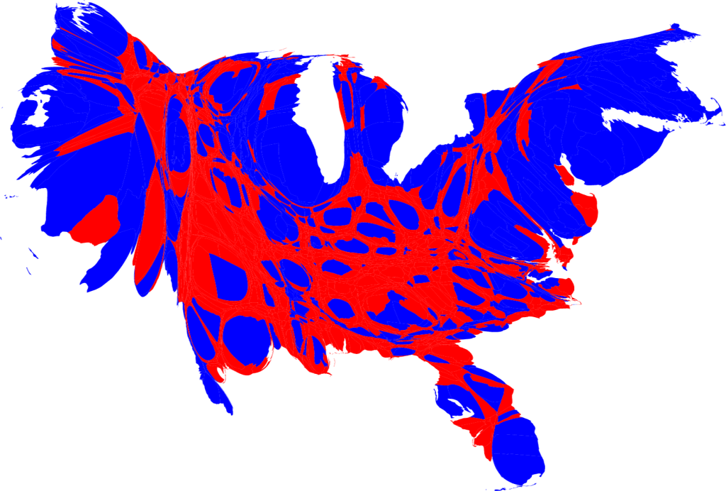
But we can go further. We can do the same thing also with the county-level election results and the images are even more striking. Here is a map of US counties, again colored red and blue to indicate Republican and Democratic majorities respectively:
Now the effects we saw at the state level are even more pronounced: the red areas appear overwhelmingly in the majority, an appearance again at odds with the actual results of the election. Again, we can make a more helpful respresentation by using a cartogram. Here is what the cartogram looks like for the county-level election returns:
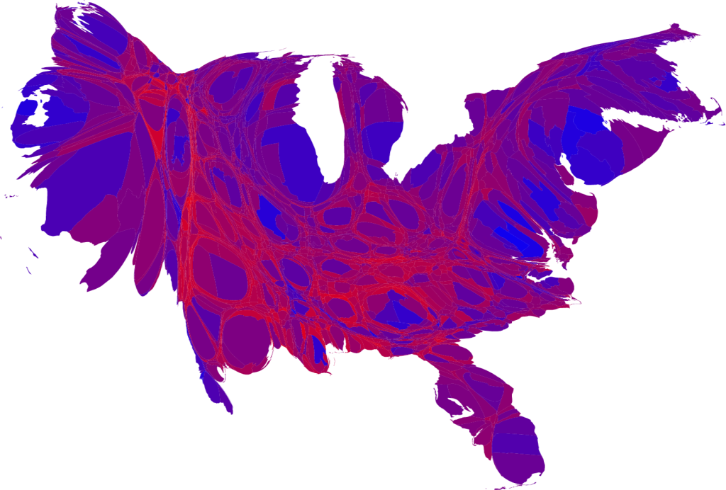
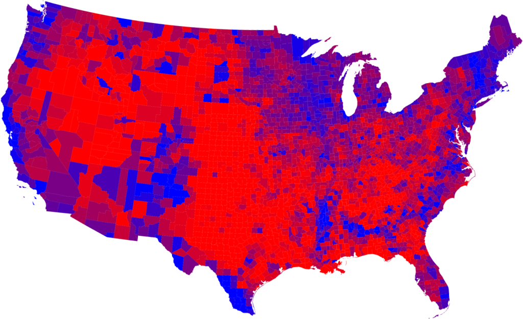
However, this map is still somewhat misleading because we have colored every county either red or blue, as if every voter voted the same way. This is of course not realistic: all counties contain both Republican and Democratic supporters and in using just the two colors on our map we lose any information about the balance between them. There is no way to tell whether a particular county went strongly for one candidate or the other or whether it was relatively evenly split.
One way to improve the map and reveal more nuance in the vote is to use not just two colors, red and blue, but to use red, blue, and shades of purple in between to indicate percentages of votes. Here is what the normal map looks like if you do this:
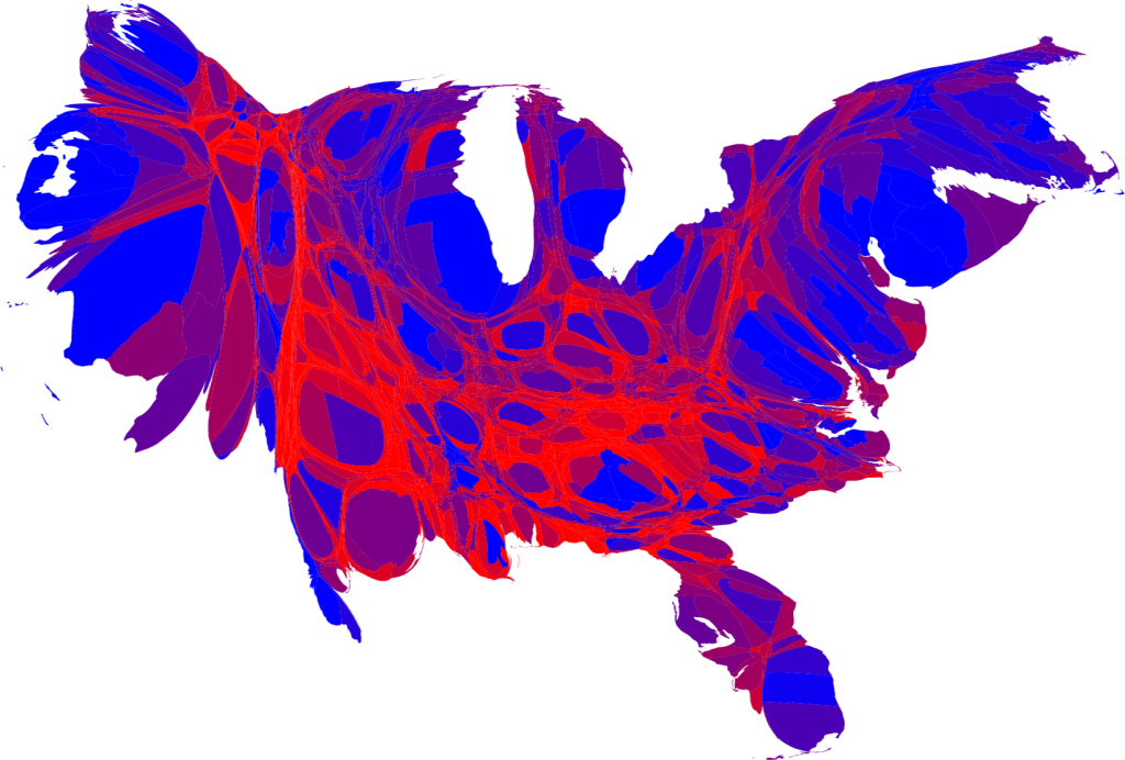
And here's what the cartogram looks like:
As this map makes clear, large portions of the country are quite evenly divided, appearing in various shades of purple, although a number of strongly Democratic (blue) areas are visible too, mostly in the larger cities. There are also some strongly Republican areas, but most of them have relatively small populations and hence appear quite small on this map.
A slight variation on the same idea is to use a nonlinear color scale like this:

These maps use a color scale that ranges from red for 70% Republican or more, to blue for 70% Democrat or more. This is sort of practical, since there aren't many counties outside that range anyway, but to some extent it also obscures the true balance of red and blue.
Haha
Anyone know what time The Speech starts at?
I'll be legging it from here to a pub and wondering what my deadline is.
Upgrade your account now to disable all ads...
Upgrade nowWe use essential cookies to make this site work, and optional cookies to enhance your experience.


")