feedback wanted - is this shit (1 Viewer)

JohnnyRaz

where the crow ate the man
Supporter
Joined
Sep 3, 2004
Messages
8,459
Location
where the crow ate the man
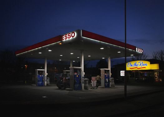
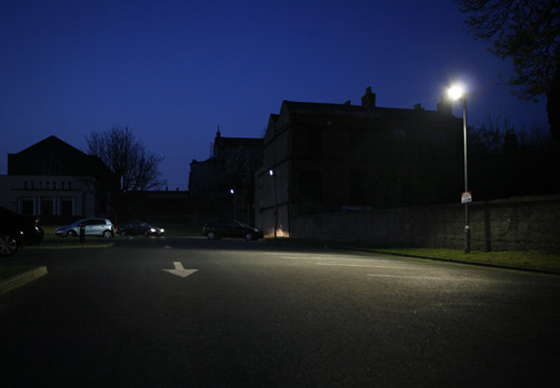
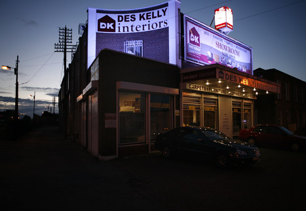
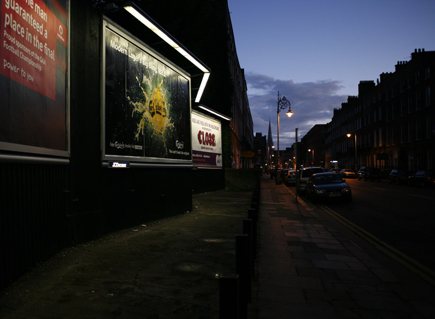
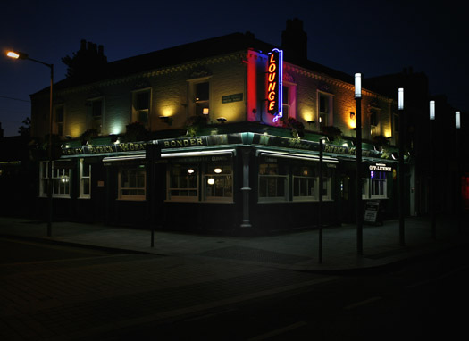
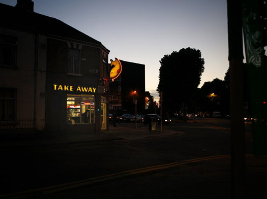
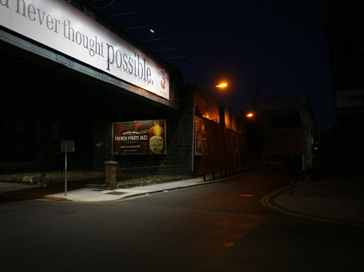
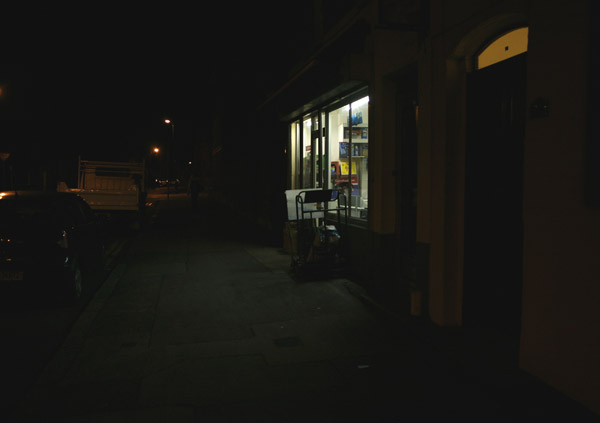
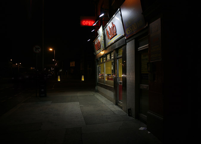
right - ive been working on a series of photos over the past year. basically Ive always been a fan of Edward Hopper - i love the sense of isolation in an otherwise busy place his paintings convey, to me anyway they give the sense of life glimpsed through the window of a passing car - where night and neon make the ordinary striking and mysterious.

arty-farty bullshit aside - Ive been trying to photograph my local area in the same way. Ive got about 10/12 favourites (below). What I'd be interested in hearing from the wise heads at thumped is
a). this is bollocks - sell your cameras and blind yourself
b). alright but a bit boring
c). alright but needs more work
d). great as it is
e). pete brady.

I apologise for the varying sizes - none of the images are edited to a standard yet - I also dont have all of them online yet, but below is a representative sample...

stat1w.jpg


clonw.jpg


desw.jpg


signsw.jpg


mcgrathw.jpg


savoy1w.jpg


rail1w.jpg


shopw.jpg


kebabw.jpg
 
I think they look very well man, my faves are the one with the lounge, the one with the empty car park and the bridge.

Im not really a fan of the familiar brands like "Vodafone/"On the Run"/"Esso" in the pictures, i think that those pictures would look waaay better if the logo's were missing, or lets say if it was just some generic neon, or something a little less well known.
I feel that these logos are a little distracting and take away from the minimalism.. just my two cents. Great stuff though!
 
Pretty similar feelings to goldiejam, carpark, lounge and take away are the standouts, the others either have too obvious branding going on or a tad boring. I think the esso one would be cool if it was taking from a different angle so that the yellow on the run shopfront wasn't visible. I also really like the second last one but it might be a tad lacking in something (maybe colours).
 
Hmm - thanks for the feedback lads - the branding thing is a point alright.
Thanks for the input

goldie - Ive just remembered I offered to dev some neopan for you a few months ago! sorry, slipped my mind completely!
 
i'd say the opposite, sort of: if the branding happens to be in frame when the shot is composed, and it feels like it's legitimately part of the shot, then keep it.

good stuff. it's difficult to take 'landscape'-style urban night photos well -- keep it up!
 
goldie - Ive just remembered I offered to dev some neopan for you a few months ago! sorry, slipped my mind completely!

no bother man, i went out and picked up some rodinal a few weeks back, it made sense as i have the tank/reels anyway..
 
I would suggest that you work at the same time of day or at least when the sky is the same colour. I.e black or dark blue but not both it breaks up the flow for me. also you might look at the historic asspect of some of the buildings. Essentially very little of that landscape has changed over the last 100 years except for the neon, for example the georgian street still uses the georgian lightposts but they've been updated to use electric lights. For that reason my faves are the georgian street with the ads, the chip shop and the pub,

If you're working in the city I would try not to include anything which thematicly jars with the "city" as a landscape, for this reason the Des Kelly and the Filling station strike me as a little too suburban. They seem to have too much space in the frame and open skies which suggests a degree of open space and therefore freedom etc, whereas the city looking ones are fuller the skies are absent or very small suggesting a degree of isolation amid claustrophobia (if you get me) which works best for me.

I like them though keep it up.


Oh and be safe.
 
do you have them any bigger somewhere?
they're very small on screen, and the generally whitish background of thumped makes them look darker than they probably are - and they're very dark to begin with.

also, where do you live? i'm about a five minute walk from cross guns bridge, so it looks like we're bear neighbours.
 
The third one is the only one I don't like. The rest are great. The logos are jarring now, but even 5 years from now, they'll have a historical resonance that'll be great. Gonna be selling prints?
 
magic - I dont have them larger online - and they definitely look better somewhat bigger (having tried a couple of print sizes). They are pretty dark to begin with - in order to emphasise the light sources Ive underexposed by 1-2 stops in most cases.

Im the other side of things - in the shaddow of croker!
 
gombeen -it's funny - the des kelly one was one of my initial fave's, but over time Im losing my fondness for it.

in the hypothetical event of me finishing this project and maybe having a hypothetical exhibition(hypothetically next autumn?), then hypothetical prints will be on sale!

In the meantime I can sort you out with a real world one if you cant wait?
 
The beef with the logo's is bollix Johnny.
If these were shots of California or "anytown USA" then the logo's & adverts would be authentic. As they are here.
Familiarity breeds contempt. Fuck the begrudgers.
 

Users who are viewing this thread

Activity
So far there's no one here
Old Thread: Hello . There have been no replies in this thread for 365 days.
Content in this thread may no longer be relevant.
Perhaps it would be better to start a new thread instead.

21 Day Calendar

Lau (Unplugged)
The Sugar Club
8 Leeson Street Lower, Saint Kevin's, Dublin 2, D02 ET97, Ireland

Support thumped.com

Support thumped.com and upgrade your account

Upgrade your account now to disable all ads...

Upgrade now

Latest threads

Latest Activity

Loading…
Back
Top